How to Create a Form using Formik
See also: React forms using Formik
Introduction
MilMove is transitioning to use Formik for rendering forms for data entry. This document strives to layout some of the basics of how to use it and links to helpful documentation.
TL;DR
- Formik the form library
- Yup the validation library
- react-uswds a NPM package of all the USWDS components as react components
- MilMove Storybook a static site generated by builds of main
Form Libraries
What is Formik?
Formik is a form library that aims to help with creating, maintaining, and handling forms when using React. The formik documentation is good place to start. Below is an example of a simple form wrapped in a Formik context. To see this example working check out the storybook page
<Formik
  initialValues={{ firstName: '', lastName: '', email: '' }}
  validationSchema={Yup.object({
    firstName: Yup.string().max(15, 'Must be 15 characters or less').required('Required'),
    lastName: Yup.string().max(20, 'Must be 20 characters or less').required('Required'),
    email: Yup.string().email('Invalid email address').required('Required'),
  })}
  onSubmit={onSubmitHandlerFunction}
  onReset={onResetHandlerFunction}
>
  <Form>
    <TextInput name="firstName" label="First Name" type="text" />
    <TextInput name="lastName" label="Last Name" type="text" />
    <TextInput name="email" label="Email Address" type="email" />
    <div className="display-flex">
      <Button type="submit">Submit</Button>
      <Button type="reset" secondary>
        Cancel
      </Button>
    </div>
  </Form>
</Formik>
Form Validation, Yup?
Formik leaves form validation work to their users, this allows the users to select their own validation library or implement one on their own. Formik recommends a library called Yup and integrates with it seemlessly. MilMove has chosen to use this library as well for validation because of its simplicity, support for many form validation rules, and its integration with Formik. Below is a snippet of code that shows how you can declare the validationSchema using the Yup library so that Formik will automatically validate your form.
<Formik
  initialValues={{ firstName: '', lastName: '', email: '' }}
  validationSchema={Yup.object({
    firstName: Yup.string().max(15, 'Must be 15 characters or less').required('Required'),
    lastName: Yup.string().max(20, 'Must be 20 characters or less').required('Required'),
    email: Yup.string().email('Invalid email address').required('Required'),
  })}
  ...
>
  <Form>
...
React USWDS integration
MilMove is making use of the react-uswds package to leverage the USWDS components built for react. These components are just thin wrappers around the basic html, which makes them easy to use in any react project.
This means that we cannot really make use of both the form components provided by Formik and react-uswds. For this reason we are wrapping the react-uswds form components to connect them properly to Formik while still displaying in the USWDS style. An example of this can be seen in src/components/form/fields/TextInput.jsx, which wraps the basic USWDS TextInput component to connect it to Formik. Another example is the Form component src/components/form/Form.jsx. It is expected that we will add more field wrappers as we develop forms.
TextInput
There are two components defined in src/components/form/fields/TextInput.jsx to allow reuse of the ErrorMessage and USWDS TextInput pattern.
TextInputMinimal
This component renders a UswdsTextInput from react-uswds and an ErrorMessage. The latter component is basically the same version of ErrorMessage from react-uswds but with support for showing or hiding based on a prop.
As you can see in the code below we call useField which is a hook from Formik that provides access to the appropriate properties and callbacks for our field based on the react context that this component is used in. It also provides access to the Formik context for form meta data, which includes if a field has been touched or has any validation errors. This component uses that information to appropriately display an error message.
...
import { useField } from 'formik';
...

export const TextInputMinimal = ({ id, name, ...props }) => {
  const [field, meta] = useField({ id, name, ...props });
  const hasError = meta.touched && !!meta.error;
  return (
    <>
      <ErrorMessage display={hasError}>{meta.error}</ErrorMessage>
      <UswdsTextInput id={id} name={name} {...field} {...props} />
    </>
  );
};
TextInput
This component renders a text input field that follows the USWDS standard for a TextInput component. It makes use of Formik's useField hook to extract the meta data for the field to support checking touched and errors to appropriately set the props on the FormGroup and Label. It then includes the TextInputMinimal component from above.
...
import { useField } from 'formik';
...

export const TextInput = ({ label, id, name, ...props }) => {
  const [, meta] = useField({ id, name, ...props });
  const hasError = meta.touched && !!meta.error;
  return (
    <FormGroup error={hasError}>
      <Label error={hasError} htmlFor={id || name}>
        {label}
      </Label>
      <TextInputMinimal id={id} name={name} {...props} />
    </FormGroup>
  );
};
Form
This component wraps the React USWDS Form and makes use of the useFormikContext hook to tie in the react-uswds Form component into the Formik context that is being used. The context hook provides the callbacks for handling submit and reset of the form, as well as all the errors and touched state. The latter two items are passed to the errorCallback method if there is one. This feature was needed to pass the error and touched state up for StackedTableRowForm.
This component also uses the useEffect React Hook since errorCallback is currently used by StackedTableRowForm to update the state of its parent, and this is a functional component. If it were a class component we could just call the errorCallback in the appropriate React lifecycle method.
...
import { useFormikContext } from 'formik';
...

export const Form = ({ errorCallback, ...props }) => {
  const { errors, touched, handleReset, handleSubmit } = useFormikContext();
  React.useEffect(() => {
    if (errorCallback) {
      errorCallback(errors, touched);
    }
  });
  return <UswdsForm onSubmit={handleSubmit} onReset={handleReset} {...props} />;
};
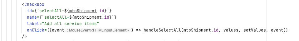
Checkbox
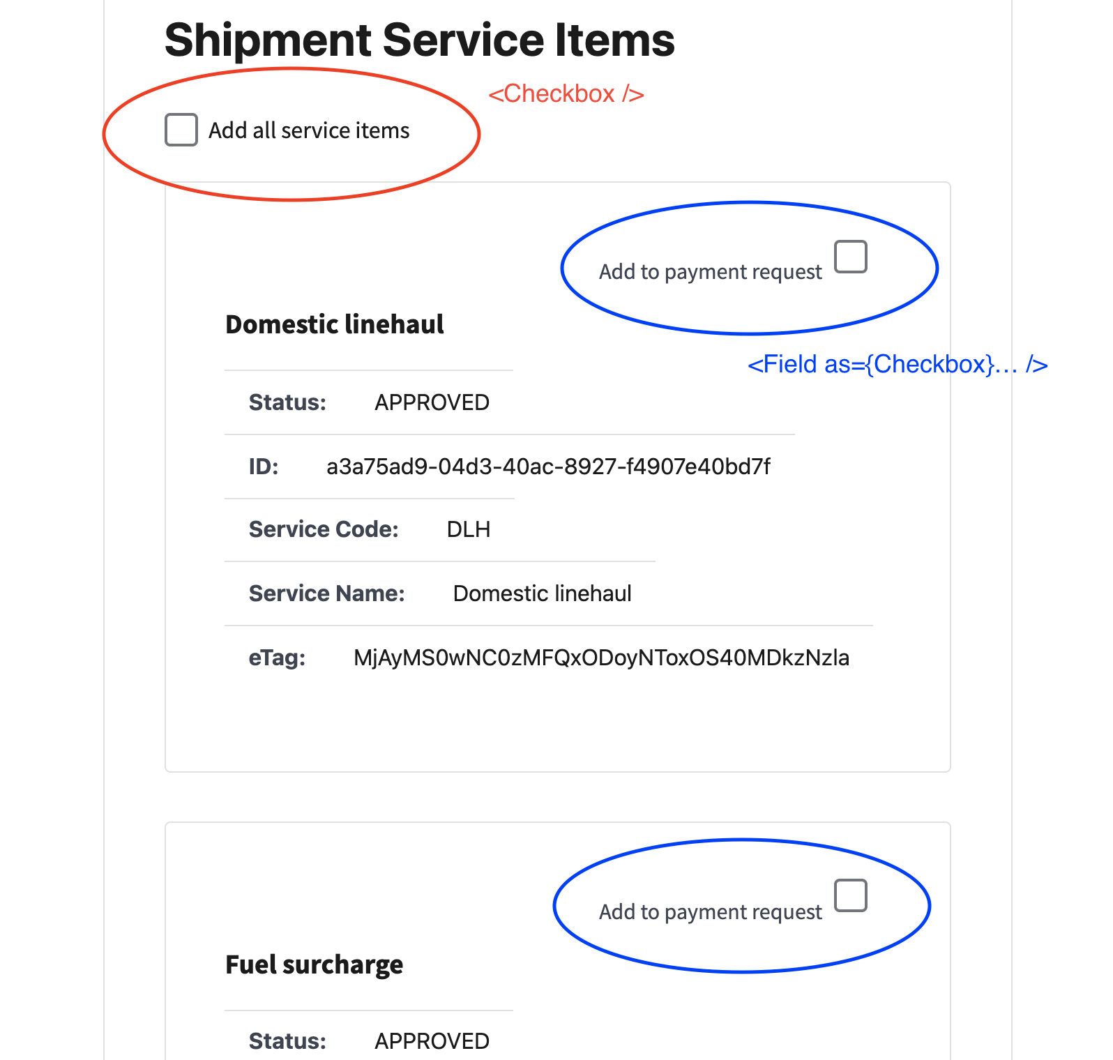
<Checkbox /> used as a select all checkbox. You will define your own handler.
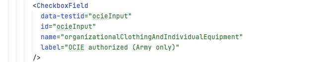
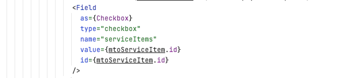
<CheckboxField> wraps a formik <Field as={Checkbox}>. This will give you the default behavior of a checkbox.
Storybook Form Stories
There are a couple sample forms in storybook that show how to setup a form and its actions with the MilMove components.
Samples > Form > personal info
A simple form that renders 3 text input fields, a submit and a cancel button. You can see it here in storybook or the story source. This form is wired up with some basic validations on each of the fields as well as storybook actions so that you can see what values are submitted. This example also makes use of the storybook state plugin to allow the form to save data in storybook, at least until you reload.
Samples > Form > inline first name
This is a variation of a simple form that makes uses of the StackedTableRowForm that makes a Formik form inside one row for use with the new MilMove StackedTable layouts. See here in storybook, storybook story source, or component source code src/components/form/StackedTableRowForm.jsx. This sample displays a StackedTable with 2 rows, one for first name and one for last name both of which are editable in a similar fashion to the personal info example above.
StackedTable > with buttons to edit
This is an example of a Formik form in a component that will be used in several places of the new MilMove designs. It is similar to the above example, but differs in a couple ways. First, it doesn't make use of the storybook state plugin so no values are saved. Second, this component uses the new design for showing errors in stacked tables by adding a red bar to the left of the label and leaving the error message in red. See in storybook or storybook story source